


Focus keyword: paint colors people regret
Meta title: Paint Colors People Regret Most — Avoid These Common Mistakes
Meta description: Discover the paint colors people regret most and how to fix them. Learn expert tips for choosing nuanced shades, testing large samples, adjusting lighting, and when repainting is the smartest move.
H1: Paint Colors People Regret — What to Avoid and How to Fix It
Intro
Choosing a paint color feels simple until you’re staring at a finished wall that looks nothing like the sample. Interior designers report two recurring regrets: overly bright, “Crayola-box” hues and cool, sterile whites that read icy instead of crisp. This guide explains why these choices fail, how to test smarter, and the practical fixes that restore a room’s balance.
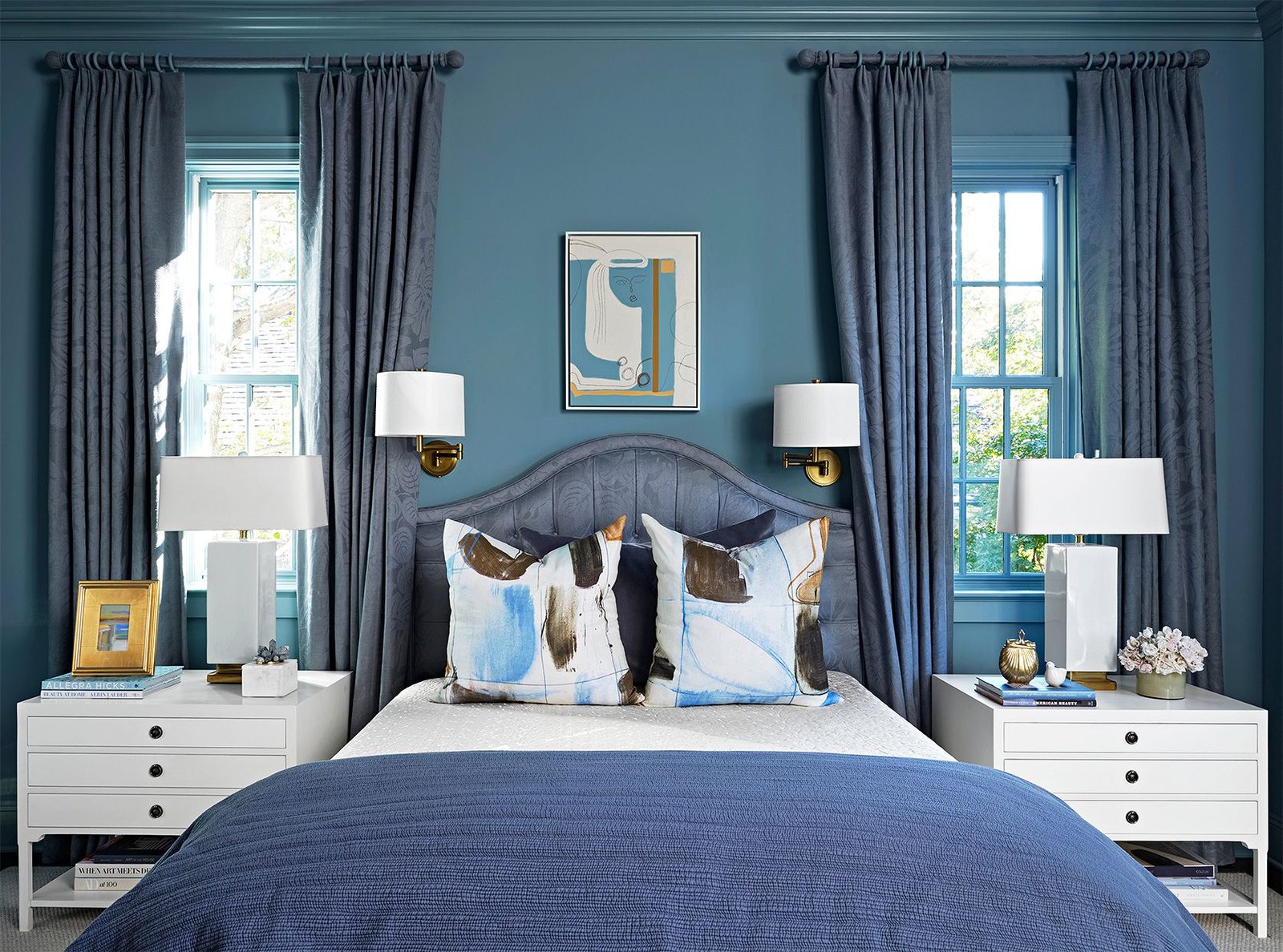
H2: Why paint choices backfire
– Undertones matter: Two whites or two blues can read totally different depending on subtle undertones. See Sherwin‑Williams’ guide on color undertones for examples.
– Light changes everything: Direction, window size and bulb temperature shift how paint appears across the day. The Energy Star page on lighting and color temperature explains how warmer bulbs can change perception.
– Small samples lie: Tiny swatches don’t show how a color interacts with surrounding surfaces or different walls.
H2: The most regretted colors (and how to handle them)
H3: “Crayola-box” brights — why they disappoint
What it is: Pure, saturated reds, blues, greens, yellows and oranges that feel childlike and flat when used on full walls.
Why they fail: These basic brights lack depth and undertone complexity, which makes them read cartoonish in adult living spaces. Designers Mallory Robins and Elizabeth Bennett advise choosing versions with a bit of “dirt” — a muted, muddier quality — that retains personality without feeling juvenile.
Fixes:
– Swap for a muddier shade from a brand known for nuanced colors (for example, explore Farrow & Ball’s palette).
– Use saturated brights as accent walls or accessories rather than roomwide colors.
– If repainting is unavoidable, it’s often less costly than buying new furnishings and décor to compensate; compare cost estimates for repainting to refurnishing on resources like HomeAdvisor.
H3: Cool, icy whites — why crisp can become cold
What it is: Whites that skew blue or gray and appear sterile and flat once on the wall.
Why they fail: A “crisp” cool white may look clean on a sample but can feel uninviting in real settings, especially under cool light. Jessica Alpert notes that clients often regret cool whites that end up feeling icy.
Fixes:
– Adjust lighting: Replace cool (5000K+) bulbs with warmer LEDs (2700–3000K) to soften a cool white; Energy Star explains bulb color temperatures and their effects.
– Soften with textiles and finishes: Add warm wood tones, rugs, or soft throws to counteract chill.
– Sample larger areas and multiple walls: Test big painted rectangles and review them in morning, afternoon, and artificial light before committing.
H2: Practical steps to avoid regret before you paint
– Choose the right sample size: Paint large swatches on at least two walls and observe at different times of day. HGTV’s guide to testing paint colors has practical sampling tips.
– Consider undertones: Research how a color leans (warm vs. cool) using manufacturer resources like Sherwin‑Williams’ undertone explanations and compare multiple brands.
– Opt for slightly muted versions of bold colors: If you love red, look for reds with brown or deep plum undertones rather than pure candy-apple tones.
– Plan fixtures and lighting early: Lighting can rescue or ruin a paint choice — plan fixture style and bulb color temperature before finalizing paint.
– Try temporary solutions first: Use removable wallpaper or large textiles to trial a visible color presence without committing to paint.
H2: When repainting is the right solution
If a room already feels wrong, professional designers often recommend repainting rather than attempting to “fix” the color with furniture or art. Repainting typically has a predictable cost and guaranteed result compared with purchasing multiple decor pieces to mask an unsuitable wall color. For budgeting, see repaint cost estimates and averages on HomeAdvisor.
H2: Quick checklist — avoid paint regrets
– Test large swatches on multiple walls.
– Inspect samples at different times and with both natural and artificial light.
– Favor nuanced, slightly muted shades over pure brights for main walls.
– Warm up cool whites with warmer bulbs or warm-toned décor before repainting.
– Consider accenting with saturated colors instead of full-room application.
Final note
The best paint decisions come from sampling widely, understanding undertones, and anticipating lighting conditions. When in doubt, choose a slightly muddier, more sophisticated version of a color you love or reserve vivid hues for accents — and remember that repainting, while inconvenient, often yields the happiest long-term result.
External resources
– Farrow & Ball color collections: https://www.farrow-ball.com/
– How to test paint colors (HGTV): https://www.hgtv.com/design/rooms/interiors/how-to-test-paint-colors
– Paint color selection tips (Benjamin Moore): https://www.benjaminmoore.com/en-us/color-overview/color-selection
– Understanding undertones (Sherwin‑Williams): https://www.sherwin-williams.com/homeowners/color/undertones
– LED bulb color temperatures (Energy Star): https://www.energystar.gov/products/lighting_fans/lighting
– Repainting cost estimates (HomeAdvisor): https://www.homeadvisor.com/cost/painting/


