


Embrace the Trend: Color Capping for Your Home Decor
In the world of interior design, a new trend is swiftly gaining traction, captivating designers and homeowners alike: color capping. This innovative technique has been sprucing up living spaces, offering a seamless blend of color that is stylish without being overwhelming.
What is Color Capping?
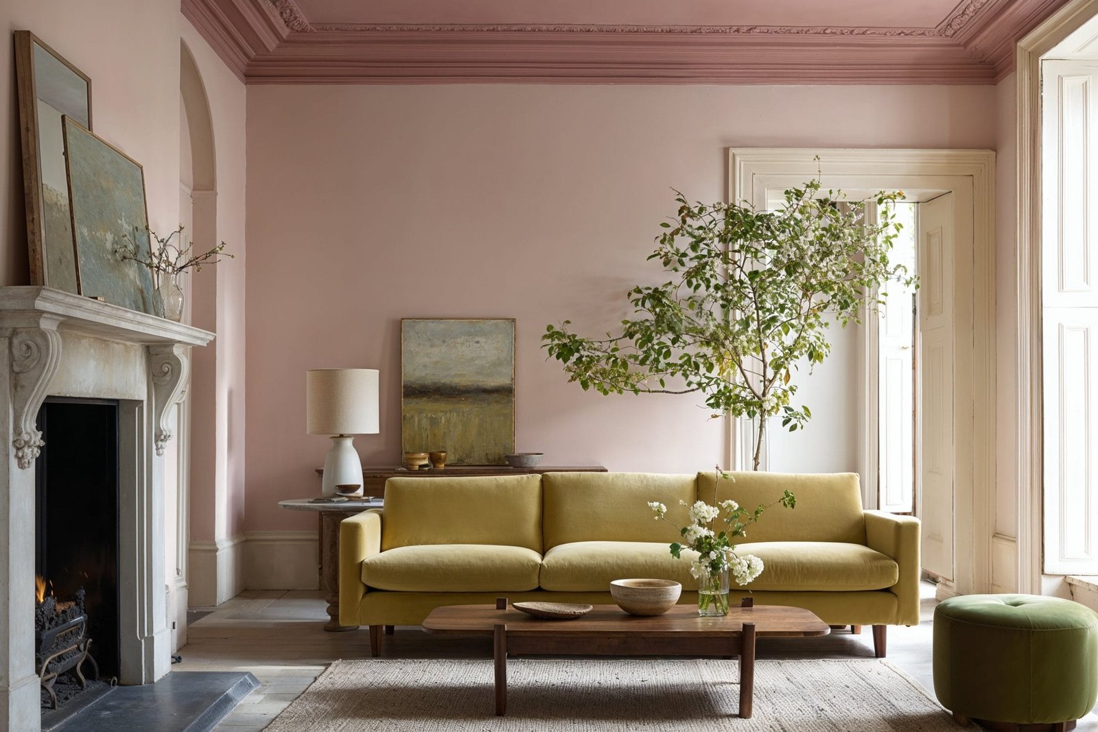
Color capping is a painting method where colors transition smoothly from the ceiling downward, creating a striking visual effect. The technique draws the eye upward, making ceilings more of a feature rather than an overlooked surface. This method suits both compact living spaces and expansive rooms, promoting an airy and open ambiance while also providing visual depth.
Typically, color capping involves selecting a light hue for the main wall, a medium shade just below the ceiling, and a darker tone that adorns the ceiling itself. However, it can be adapted in reverse to feature darker hues on the walls. This approach alters the perception of space, adding dynamic layers to any room.
Pro Tip: Discover Your Style!
To find the ideal look for your home, consider taking a free Interior Design Style Quiz.
Implementing Color Capping: Designer Tips
Color capping offers a beautifully innovative way to explore color and design. Here are key strategies designers utilize to achieve an exceptional color capping effect.
1. Choose a Cohesive Color Family
Start by selecting a strong color family consisting of at least three tones: light, mid, and dark. Shades like mauve, olive, and dusty blue can create elegant gradients. Sampling colors on the wall helps visualize the gradient effect before committing. It’s important to choose shades that contrast enough to form a visible transition without appearing too abrupt.
2. Define Your Layers with Clear Divisions
To maintain a tailored look, use painter’s tape to create crisp lines between different shades. The placement of these divisions can impact the mood—lower divisions typically lend a grounded feel, while higher divisions can make a bold statement. If your walls feature architectural elements like molding, utilize them as boundaries to enhance the color scheme.
3. Make the Ceiling a Central Feature
One distinctive aspect of color capping is that ceilings are not left stark white; instead, they often showcase the darkest color of the gradient. This twist transforms the ceiling from an afterthought into a focal point, enhancing the room’s dimensions and ambiance.
4. Utilize Earthy Tones for a Relaxed Atmosphere
Color capping works exceptionally well with earthy shades that transition naturally. Consider muted colors like sage, terracotta, and stormy blue. These tones pair beautifully with natural materials, contributing to a cohesive and serene aesthetic.
5. Enhance with Strategic Lighting
Lighting plays a crucial role in how color capping is perceived. Properly positioned lighting fixtures, such as sconces and warm bulbs, can emphasize the gradient transitions. Bright natural light will illuminate lighter colors, while softer lighting may necessitate the use of mid-tones to ensure visibility. Dimmable options offer flexibility in showcasing your color capping effects.
Ready to Transform Your Space?
If you’re eager to dive into the world of color capping, consider consulting with a professional interior designer who can help bring your vision to life. Explore comprehensive options by scheduling your free Interior Design Consultation.
By embracing color capping, you not only elevate the aesthetics of your home but also create a personalized space reflective of your style, making it a conversation starter for all who enter.


