


Title (H1): 2026 Kitchen Cabinet Colors: Top Trends, How to Pair Them, and Best Finishes
Focus keyword: 2026 kitchen cabinet colors
Meta title suggestion: 2026 Kitchen Cabinet Colors — Trend Forecast & Styling Tips
Meta description suggestion: Discover the top 2026 kitchen cabinet colors—warm neutrals, greens, clay tones, and sophisticated blacks—plus pairing advice, hardware tips, and paint/finish recommendations.
Introduction
The 2026 kitchen cabinet colors lean into warmth, depth, and a renewed appreciation for nature-inspired hues. Homeowners and designers are moving away from washed-out greiges and icy whites toward warm beiges, earth-forward clay shades, and a spectrum of greens—from soft sage to deep forest. This guide explains each trend, offers pairing and finish suggestions, and links to trusted resources to help you choose the right look for your kitchen.
H2: Why 2026 is About Warmth and Natural Color
Design experts point to a desire for comfort, authenticity, and longevity in kitchens. Rather than short-lived fads, many of the trending tones are grounded in tradition and wellness-focused palettes that age well and pair with natural materials. For background on broader paint and color trends, see resources from Behr and Benjamin Moore.
H2: Shades of Black — Sophisticated and Layered
H3: What to Expect
Black and blackened-green hues are gaining traction as refined, architectural choices for cabinetry. These tones add drama while acting as versatile anchors for both contemporary and traditional kitchens.
H3: How to Style
– Pair with warm wood elements and mixed metals to avoid a flat, sterile effect. See examples of moody cabinetry at deVOL.
– Mix new sleek hardware with vintage or collected pieces for a collected, lived-in look.
H2: Dark Greens — Cozy, Dramatic, Neutral Alternatives
H3: Why They Work
Deep forest and earthy greens function like neutrals but with personality. They add depth and make a room feel intimate and inviting.
H3: Pairing Ideas
– Combine dark green cabinets with natural stone countertops or warm woods to keep the space cozy.
– For a bold, color-drenched approach, repeat the green in accent tiles, shelving, or textiles for a cohesive statement.
External example: Architectural Digest and Houzz frequently showcase kitchens using green cabinetry to great effect.
H2: Mid-Tone Greens — Heritage and Warmth
H3: What These Shades Convey
Mid-tone greens—think olive to muted moss—evoke heritage and authenticity. Designers are pairing richer woods like walnut with these greens to restore a sense of depth lost during the pale-finish era.
H3: Where to Use Them
– Islands or lower cabinetry are prime spots to introduce mid-tone green without overwhelming the room.
– Work well in kitchens that blend modern appliances with traditional details.
H2: Light Greens — Muted, Cool, and Versatile
H3: The Look
Soft, silvered greens and subtle sage provide a cool, elevated alternative to cream or grey. These shades are versatile in both kitchens and bathrooms.
H3: Pairings
– Pair light greens with creamy whites and natural wood to maintain brightness.
– Add brass or matte black hardware for contrast.
H2: Warm Browns & Clay-Inspired Tones — Earth-Forward Comfort
H3: Trending Shades
Terracotta, rust, cinnamon, and soft umber are rising. These colors lend character and warmth, creating kitchens that feel grounded and intentional.
H3: Styling Tips
– Balance clay tones with neutral walls and wood or stone accents to create contrast.
– Use clay cabinetry to make a comfortable, approachable focal point without being overly bold.
For color inspiration and swatches, consult Behr’s color resources and trend collections.
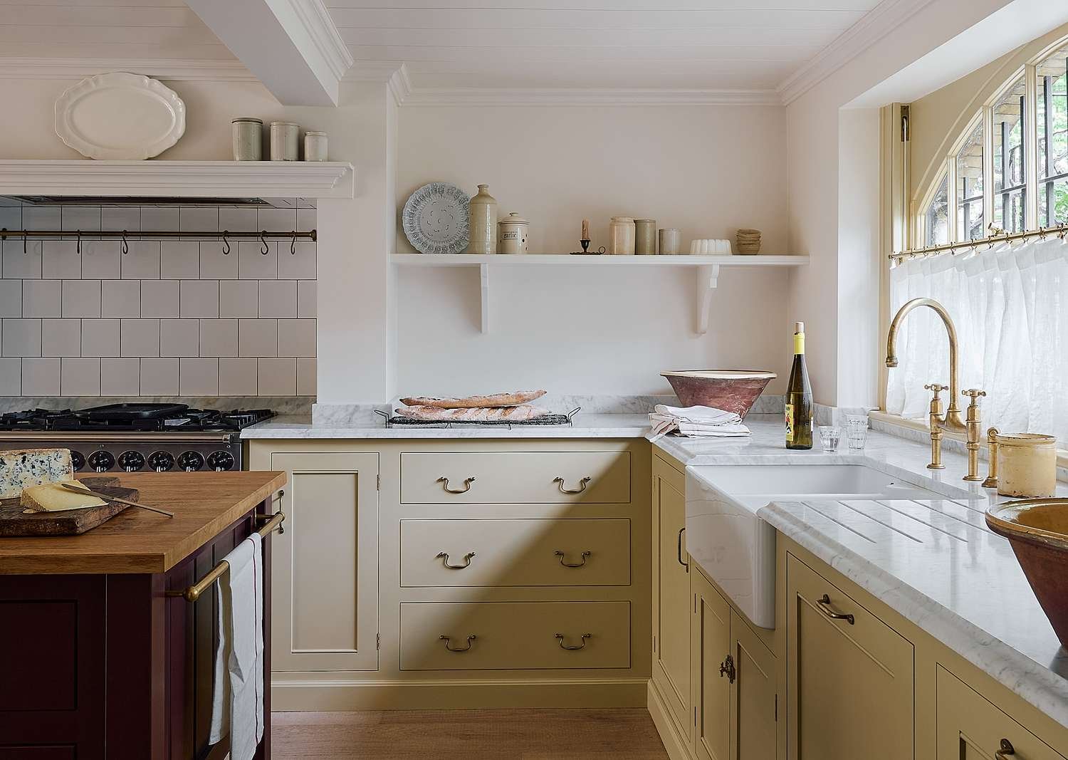
H2: Warm Neutrals — The New Everyday Luxury
H3: Shades to Consider
Cashmere, creamy beiges, and gentle warm taupes are replacing stark whites and cool greys. These tones read as sophisticated, calming, and timeless.
H3: How to Accessorize
– Complement warm neutrals with vintage cane furniture, dried botanical accents, and handmade rugs for an intentional, uncluttered aesthetic.
– Lighter kitchens benefit from textured flooring—stone or brick—that reinforces the warmth.
H2: Choose the Right Finish and Paint Type
H3: Sheen and Durability
– Semi-gloss and satin finishes are popular for cabinetry because they’re easy to clean and highlight details. For a more modern, matte appearance, consider low-sheen lacquers with durable topcoats.
– For technical guidance on finishes and maintenance, Sherwin-Williams and Benjamin Moore provide helpful paint-sheen overviews.
H3: Professional vs. DIY
– Custom or factory-finished cabinetry often offers longer-lasting results.
– If painting existing cabinets, invest in proper priming and a durable topcoat designed for cabinetry to prevent chipping and wear.
H2: Hardware, Lighting, and Trim — Small Details, Big Impact
H3: Hardware Choices
– Sleek channel pulls and handle-free profiles suit contemporary color statements.
– Brushed brass, aged bronze, or matte black can warm up or contrast a palette depending on the shade.
H3: Integrated Lighting and Accents
– Integrated under-cabinet lighting and metallic trims can modernize warm tones and accentuate texture.
– Open shelving or glass-fronted upper cabinets help balance darker lower cabinetry and keep sightlines open.
H2: How to Pick the Right Shade for Your Space
H3: Test in Real Conditions
– Always sample paint on full-size cabinet doors or large boards and observe them at different times of day and under different lighting.
– Consider the effect of nearby materials—flooring, countertops, and backsplash—before committing.
H3: Consider Longevity and Resale
– Neutral warm tones and mid-tone greens generally appeal to a broader audience and stand the test of time.
– Bold, saturated colors can be used strategically (island, lower cabinets) if you want impact without long-term commitment.
H2: Where to Find Color Inspiration and Tools
– Manufacturer and brand trend pages: Behr color trends, Benjamin Moore color resources.
– Cabinet makers and design studios: KraftMaid ideas and deVOL portfolios.
– Trend and project galleries: Architectural Digest and Houzz showcase real-project examples and styling angles.
H2: Final Tips for 2026 Kitchen Cabinet Colors
– Lean into warmth: warm neutrals and earth tones are crowd-pleasing and timeless.
– Don’t shy away from green: from sage to forest, green is versatile and pairing-friendly.
– Mix materials: wood, stone, metal, and textiles prevent a single color from feeling flat.
– Test extensively and invest in quality finishes for longevity.
Closing
Whether you prefer a soft cashmere neutral, a clay-inspired cabinet, or a dramatic blackened green, 2026 kitchen cabinet colors emphasize warmth, depth, and natural influence. Use the pairing and finish tips above, test samples in your home’s light, and consult paint and cabinet specialists for professional application.
Further reading and resources
– Behr Color Trends and Inspiration: https://www.behr.com/consumer/colors/color-trends
– Benjamin Moore Color Resources: https://www.benjaminmoore.com/en-us/color-overview
– Sherwin-Williams Paint Finish Guide: https://www.sherwin-williams.com/homeowners/color/paint-colors
– KraftMaid Design Ideas: https://www.kraftmaid.com
– deVOL Kitchens Portfolio: https://www.devolkitchens.co.uk
– Houzz Kitchen Trend Galleries: https://www.houzz.com/photos/kitchen
(Use these links to explore palettes, swatches, and real kitchen projects that reflect the 2026 cabinet color trends.)


