


Focus keyword: patina blue
Meta title: Patina Blue: How to Use Etsy’s 2026 Color of the Year in Your Home
Meta description: Discover Etsy’s 2026 color of the year—patina blue—and learn where to use it, complementary colors and finishes, paint matches from top brands, and practical tips for pulling off the patina trend at home.
H1: Patina Blue — Embrace Etsy’s 2026 Color of the Year and the Patina Trend
Intro
Etsy’s 2026 color of the year, patina blue, brings a relaxed teal-leaning blue with an antique, sea-weathered vibe that’s both bold and calming. Inspired by the green-blue shifts of aged metals and worn wood, patina blue works equally well as a dramatic room drench or a subtle accent. Below you’ll find clear, actionable ways to use this trending shade, paint matches from major brands, and styling ideas that lean into the vintage patina aesthetic.
H2: What is patina blue and why it’s trending
Patina refers to the textured, color-shifting surface that develops on old metal and wood—think verdigris on copper or the softened hues of reclaimed wood. For a basic definition, see Patina on Wikipedia. Etsy’s patina blue emphasizes a deeper, blue-forward teal that reads as serene and sophisticated while still feeling lived-in. This shade taps into broader 2026 palettes that favor calming blues and greens and the growing interest in vintage, sustainable decor.
H2: Where to use patina blue in your home
H3: Best rooms for full-color drench
– Bedrooms: Creates a restful, cocooning atmosphere ideal for sleep and relaxation.
– Powder rooms and small enclosures: These compact spaces tolerate bold color drenching without overwhelming the home’s flow.
– Accent walls in living rooms or home offices: Use a single patina blue wall to provide visual interest and depth.
H3: When to choose accents instead of full paint
If you’re hesitant to commit to full walls, introduce patina blue through cabinetry, bookshelves, doors, or furniture. Accent pieces let you test the tone and are easy to swap if you change your mind.
H2: Complementary colors and finishes for the patina trend
– Warm metals: Copper and brass emphasize the “aged metal” feel and enhance the patina effect.
– Neutrals: Off-whites and warm browns balance the coolness of patina blue and keep rooms from feeling cold.
– Other blues and greens: Layer similar tones for a rich, monochromatic palette.
– Bold accents: Mustard yellow or deep terracotta can add contrast and energy.
For inspiration on coordinating palettes and finishes, see design resources at Pantone and interior design publications.
H2: Paint brand matches and where to buy
If you want ready-made color matches, consider well-known brands that offer close alternatives:
– Valspar — Mykonos Reflection (look for Valspar’s site for product specifics)
– Benjamin Moore — Champion Cobalt (check Benjamin Moore for the closest swatch)
Always get a physical swatch or sample pot and test on your wall—lighting dramatically affects how patina blue reads in your space.
H2: Styling with vintage finds and thrifted pieces
Patina blue pairs naturally with vintage and secondhand items. Scour local thrift stores or Etsy’s vintage marketplace for copper planters, brass frames, and worn wooden furniture to reinforce the aged, collected look. Shopping vintage not only enhances the aesthetic but supports sustainability.
H2: Practical painting tips for a successful patina blue finish
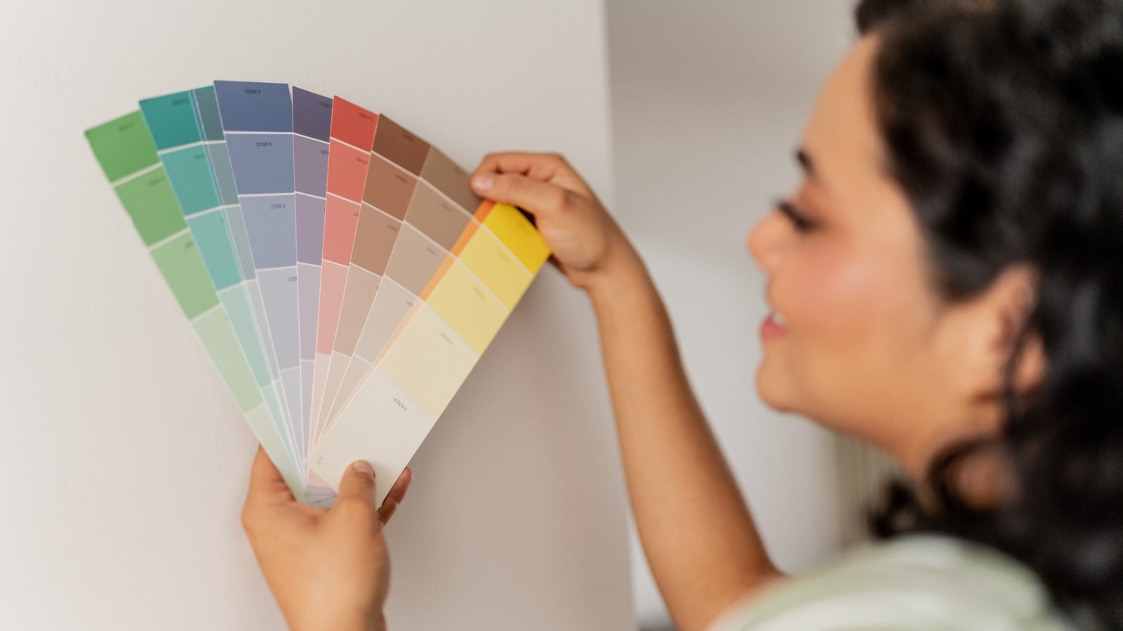
– Test first: Paint large samples on different walls at varying light levels and view at morning/evening.
– Choose the right sheen: Matte or eggshell sheens amplify the soft, aged look; satin or semi-gloss are better for cabinetry and high-traffic surfaces.
– Prep matters: Proper priming ensures even color and hides underlying pigments that can shift the tone.
– Layer with accents: If doing a full room, balance the intensity with lighter textiles, natural wood, and metallic hardware.
– Use sample pots and small projects: Try patina blue on a piece of furniture before committing to an entire room.
H2: Quick FAQ (helps SEO and reader intent)
H3: Is patina blue a warm or cool color?
Patina blue leans cool because of its blue base, but its teal undertones and pairing with warm metals can introduce warmth into a scheme.
H3: Can patina blue work in small spaces?
Yes—patina blue can visually deepen small rooms. In tight spaces, consider color drenching a powder room or using it on cabinetry to add personality without shrinking the room.
H3: How do I match fabrics and decor?
Choose soft, aged textures—linen, distressed leather, patinated metal, and piled rugs—that echo the lived-in patina aesthetic.
H2: Final thoughts
Patina blue offers a flexible way to bring the 2026 patina trend into your home. Whether you go bold with a whole-room paint or introduce the color through vintage finds and hardware, this teal-leaning blue balances tranquility with character. Test your lighting, choose complementary finishes like brass or copper, and lean into secondhand pieces to fully capture the patina-inspired look.
Useful links
– Etsy (explore vintage and the marketplace): https://www.etsy.com/
– Patina (definition and context): https://en.wikipedia.org/wiki/Patina
– Valspar (brand site): https://www.valspar.com/
– Benjamin Moore (brand site): https://www.benjaminmoore.com/
– Pantone Color Institute (color trends): https://www.pantone.com/
Suggested slug: patina-blue-etsy-2026-color-of-the-year
Alt text suggestion for header image: “Room painted in patina blue with brass accents and vintage decor.”


