


Title: How Paint Colours That Increase Stress Can Sneak Into Your Home (And What to Do About It)
Focus keyword: paint colours that increase stress
Meta description: Discover which paint colours can elevate anxiety, why colour influences the brain (neuroaesthetics), and practical tips to choose calming palettes for every room.
URL slug: paint-colours-that-increase-stress
Primary image alt text: Assorted bright paint cans showing vivid colours
Introduction
Your home should be a refuge, not a trigger. Yet certain paint choices can unintentionally raise tension and make relaxation harder. Understanding which paint colours that increase stress—and why they affect us—helps you create a calmer, more balanced living space.
How paint colours affect the mind (Neuroaesthetics)
Colour doesn’t just decorate a room: it communicates directly with the nervous system, shaping mood, focus, sleep and social interaction. The emerging field of neuroaesthetics studies how visual elements like hue and saturation influence brain responses (see Neuroaesthetics overview). Interior designers trained in science-informed design translate these insights into palettes that support emotional balance (learn more about color psychology).
H2: Paint colours that increase stress — the usual suspects
H3: Highly saturated neons and bold primaries
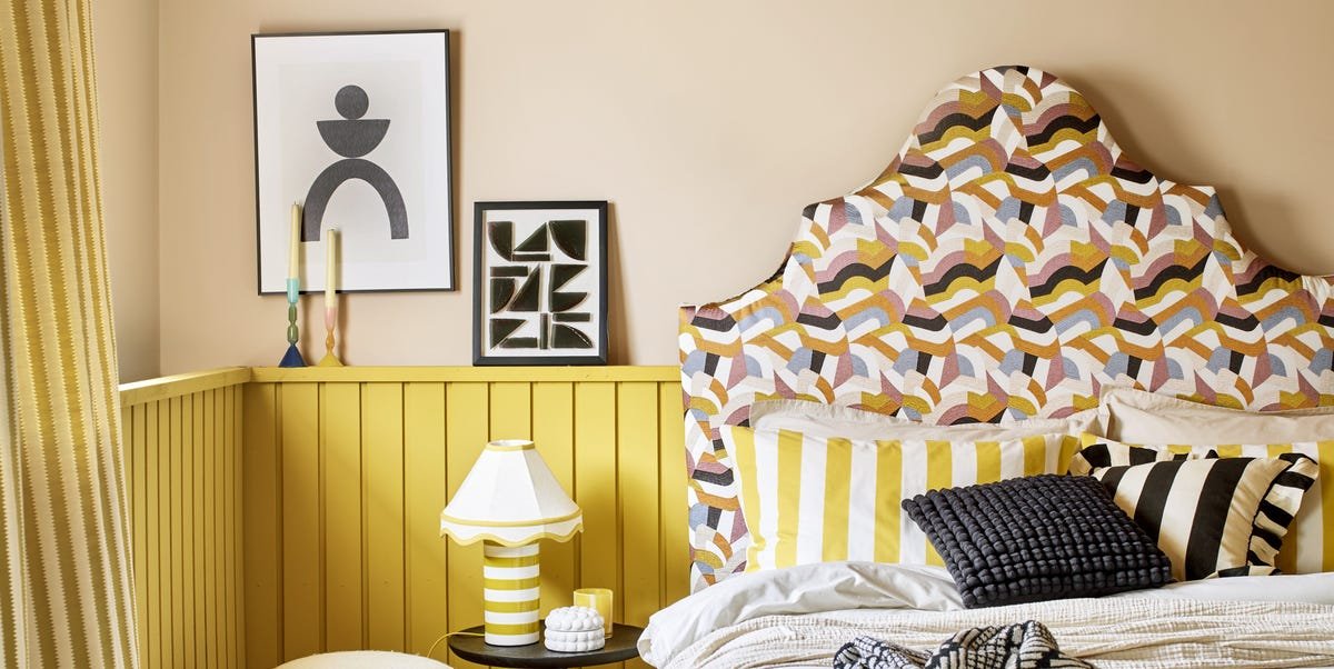
Intense, highly saturated colours—neon greens, electric yellows, fluorescent pinks—can overstimulate the senses. Bright tones push the nervous system into alert mode, making it harder to relax and recover. Even vivid reds and stark black-and-white contrasts tend to energize rather than soothe. If you love a bold shade, reserve it for small accents rather than full-room coverage.
H3: Large expanses of any single intense hue
Even a calming colour can feel overwhelming when it blankets an entire room. Large swathes of intense colour keep the brain in a heightened state of attention, preventing the natural wind-down that supports sleep and relaxation. Harsh, clinical whites can produce a sterile, high-alert feeling as well. Balance and scale matter as much as the hue itself.
H3: Jarring or high-contrast pairings
Certain pairings—very bright warm tones next to stark cool tones, or clashing saturated hues—create visual tension that translates to emotional tension. The problem often isn’t the colour itself but the intensity and how colours interact across walls, furniture and lighting.
H2: Why context and personal history matter
Colour reactions are subjective. Cultural associations and personal memories shape how a shade feels to you. A sunny yellow might feel cheerful to one person and anxiety-inducing to another who links it to a negative experience. For evidence-based background on cultural and psychological influences, see this primer on color psychology.
H2: Practical tips to avoid stress-inducing paint choices
– Desaturate when in doubt: Softer, muted tones (lower saturation) tend to reduce sensory arousal compared with neon or very bright shades.
– Use bold colours as accents: Apply intense hues to pillows, artwork, trim or a single accent wall rather than entire rooms.
– Test swatches at different times: Paint large swatches and observe them under morning, afternoon and evening light before committing.
– Balance with neutrals and textures: Natural materials (wood, linen, stone) and neutral backgrounds help anchor saturated colours and reduce visual tension.
– Consider room function: Bedrooms and relaxation areas benefit from low-stimulation palettes; creative or workout spaces can handle more energizing tones.
– Mind lighting: Artificial light temperature (warm vs. cool) changes how a colour reads; test with the bulbs you plan to use.
– Trust your gut: If a palette feels off to you, it probably will every day. Personal comfort outweighs general rules.
H2: How designers apply neuroaesthetics to create calm spaces
Designers trained in science-informed methods treat rooms as “command central” for emotional regulation—choosing hues that gently cue the brain to rest, reflect or engage. They focus on balance: combining supportive neutrals, controlled pops of colour and layered textures to prevent overstimulation while keeping spaces lively and inviting.
H2: Quick checklist before painting
– Is the hue highly saturated? If yes, reduce saturation or limit coverage.
– Will the colour cover large surfaces? If yes, opt for softer tones or breaks in the plane (trim, art, furniture).
– How does it look in your lighting? Test at multiple times of day.
– Does the palette support the room’s function? Bedrooms need calmer tones than home gyms.
– Do you have a personal or cultural reaction to this colour? If yes, weigh that reaction heavily.
H2: Resources and further reading
– Neuroaesthetics overview (Wikipedia): https://en.wikipedia.org/wiki/Neuroaesthetics
– Color psychology primer (Wikipedia): https://en.wikipedia.org/wiki/Color_psychology
– Practical health-focused guidance on colour and mood (Healthline): https://www.healthline.com/health/mental-health/color-psychology
– Tips from paint experts on color and mood (Benjamin Moore): https://www.benjaminmoore.com/en-us/for-your-home/color-selection/color-and-mood
Conclusion
No colour is inherently “bad,” but saturation, scale and pairing determine whether a paint choice calms or stresses. By applying simple principles—desaturation, balance, testing in real light and prioritizing room function—you can avoid paint colours that increase stress and make your home a true retreat.


