


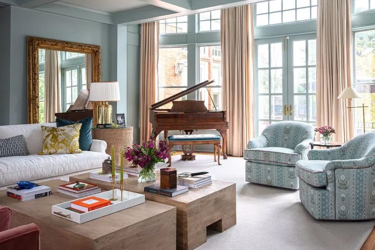
Title: Designer-Approved Paint Colors That Make Small Rooms Look Bigger
Meta title (SEO): Paint Colors That Make a Room Look Bigger — Designer Picks & Tips
Meta description (SEO): Discover 11 designer-approved paint colors and pro application tips to make small rooms feel larger. Learn how color choice, trim treatment, and paint placement transform space. (Focus keyword: paint colors to make a room look bigger)
Focus keyword: paint colors to make a room look bigger
Suggested URL slug: paint-colors-make-room-look-bigger
Intro
Choosing the right paint is one of the most cost-effective ways to change how a room reads. The right hue and application can blur edges, reflect light, or create depth—making low ceilings feel taller and compact rooms appear more generous. Below are 11 colors favored by designers, why they work, and practical application tips to maximize perceived space.
H2: Why paint changes how big a room feels
– Light-reflecting colors (especially warm whites and pale blues) increase perceived openness by bouncing daylight and artificial light.
– Continuous color (walls, trim, even ceiling) removes visual breaks and creates an uninterrupted plane that reads as larger.
– Strategic dark tones can recede visually, creating depth if used thoughtfully.
For more on the science and techniques of painting for height and space, see This Old House’s painting tips (https://www.thisoldhouse.com/painting).
H2: Designer-Approved Colors (what they are and how to use them)
H3: Sherwin-Williams Foxy
A warm apricot that reads lively without overwhelming. When applied across walls, trim, and ceiling details, Foxy creates continuity and a cozy yet expansive feel. Pair with simple, lighter furnishings to enhance the sense of openness.
Sherwin-Williams: https://www.sherwin-williams.com/
H3: Sherwin-Williams Zircon
A soft bluish-gray that reflects light well and lends an airy, sky-like quality to interiors. Use in bedrooms and home offices that benefit from a cool, calming backdrop to visually widen the room.
H3: Sherwin-Williams Rivers Edge
A light tan/taupe neutral that fades into the background—ideal for those who want a muted palette that visually expands the room while keeping warmth. Works especially well in living areas and hallways.
H3: Sherwin-Williams Lacewing
A bright, fresh green that draws the eye and distracts from limited square footage. Use as an accent wall or color-drench a small dining room to create an inviting, greenhouse-like atmosphere.
H3: Farrow & Ball Sulking Room Pink
A saturated warm pink that, when applied to walls and trim together, creates the illusion of walls pushing outward. It’s excellent for intimate dining rooms or powder rooms where an enveloping, generous feeling is desired.
Farrow & Ball: https://www.farrow-ball.com/
H3: Farrow & Ball Shaded White
A subtle warm white with a soft presence—great where you want the openness of white but with a soothing tone. Use on walls, millwork, and ceilings to maintain a seamless, airy environment.
H3: Benjamin Moore White Dove
A creamy, classic off-white that’s widely used to keep spaces light and inviting. Saturating connected architectural elements with White Dove can draw the eye up and through a narrow foyer or stairwell.
Benjamin Moore: https://www.benjaminmoore.com/
H3: Sherwin-Williams White Heron
A crisp neutral with a cool violet undertone that can feel both warm and expansive. Use it to unify open-plan areas and to maintain a fresh, clean backdrop that doesn’t visually clutter the space.
H3: Sherwin-Williams Alabaster
A soft warm white known to brighten rooms and enhance light flow. Ideal for creating an airy, welcoming atmosphere in compact kitchens and bedrooms.
H3: Sherwin-Williams Quietude
A serene blue-green with blue-gray undertones that adds calm depth without heaviness. Color-drenching a room—walls, trim, and a ceiling slightly lighter—creates seamless lines that read larger.
Sherwin-Williams Quietude overview: https://www.sherwin-williams.com/color
H3: Sherwin-Williams Peppercorn
A deep charcoal that can visually recede when used correctly. Dark walls paired with light furnishings and reflective accents (mirrors, metallics) produce perceived depth and drama without shrinking the room.
H2: How to apply color to maximize perceived space
– Color-drench: Paint walls, trim, and even the ceiling the same or coordinated shades to eliminate visual breaks. Designers often take the ceiling about 50% lighter than the wall color for balance.
– Paint ceilings pale or matching: A light or slightly tinted ceiling increases perceived height; a matching ceiling can extend the wall visually.
– Use lighter furniture and reflective surfaces: In darker rooms, contrast with paler furnishings and mirrors to push walls visually back.
– Keep trim simple: Painting trim the same color as walls reduces framing effects that make rooms feel boxed in.
For step-by-step techniques on painting ceilings and trim, consult home improvement guides like The Home Depot’s painting resources (https://www.homedepot.com/c/painting).
H2: Room-by-room recommendations
– Foyers and stairwells: Use a bright off-white (White Dove or Shaded White) to pull the eye up and through.
– Bedrooms: Soft blues and greens (Zircon, Quietude) calm the space and create an airy atmosphere.
– Dining rooms/powder rooms: Consider bold, saturated colors (Sulking Room Pink, Foxy) applied top-to-bottom for a cozy yet generous feel.
– Living rooms/open plans: Neutral tans (Rivers Edge) and warm whites (Alabaster, White Heron) keep the overall space cohesive and open.
H2: Quick checklist before you paint
– Test samples on multiple walls and observe at different times of day.
– Decide whether to color-drench or contrast trim.
– Choose finishes that optimize light (eggshell/satin for walls, semi-gloss for trim if used).
– Coordinate furnishings and lighting to support the color strategy.
H2: Frequently asked questions (FAQs)
Q: Does a darker paint always make a room feel smaller?
A: Not necessarily. Darker shades can visually recede and add depth when balanced with lighter furniture and strategic lighting.
Q: Is it better to paint the ceiling the same color as the walls?
A: It depends on the effect. A ceiling that’s slightly lighter than the walls maintains height while a matching ceiling can create a seamless, enveloping feel—both can make a room appear larger when applied correctly.
Q: How many paint samples should I try?
A: At least three: a light, medium, and one accent or saturated option. Test under daylight and artificial light to see undertones.
External resources and brands
– Sherwin-Williams color information: https://www.sherwin-williams.com/
– Benjamin Moore color guides: https://www.benjaminmoore.com/
– Farrow & Ball color collection: https://www.farrow-ball.com/
– Painting and application techniques: This Old House — Painting Tips (https://www.thisoldhouse.com/painting)
– Home improvement painting resources: The Home Depot Painting Tips (https://www.homedepot.com/c/painting)
Closing
The right paint color—paired with strategic application—can dramatically change how a room feels. Use these designer-approved hues and practical techniques to make even the smallest spaces feel open, cohesive, and inviting.
Image suggestions (for SEO): include photos of each color applied in a real room, with descriptive alt text such as “Sherwin-Williams Foxy warm apricot living room that appears larger” to improve search relevance.
