Focus keyword: paint colors out of style 2026
Meta title: 6 Paint Colors Designers Say Will Be Out of Style in 2026 — What to Use Instead
Meta description: Designers predict a shift away from cool grays, stark whites, millennial pink, and some blues and greens in 2026. Learn which paint colors are falling out of favor, why, and the warm, earthy alternatives to choose for lasting style.
H1: Paint Colors That May Be Out of Style in 2026 — and Better Alternatives
Designers across the U.S. predict a clear color shift for 2026: cool, impersonal neutrals and a few past fashion-forward hues are losing ground to warmer, moodier, and earth-driven tones. Below are the key paint colors expected to decline, why they’re falling out of favor, and concrete alternatives and tips to help your home feel current and timeless.
H2: Gray — Why “Millennial Gray” Is Losing Its Luster
H3: What’s changing
For years, cool grays dominated interiors. Designers now say those shades can feel sterile and overused, especially in spaces that benefit from warmth or texture. Because gray has been so pervasive, many homeowners and designers are actively moving away from the “millennial gray” aesthetic.
H3: Smart alternatives
– Greige and taupe-gray: If you like a neutral gray base, choose greige or taupe-gray tones with warm undertones for better harmony with wood, brass, and layered textiles (see Sherwin‑Williams greige options).
– Dark brown or dark bronze: For moody sophistication instead of charcoal gray, consider deep brown or bronze paints to add richness and warmth.
– Tip: Layer textured finishes (rugs, woven fabrics, wood) to avoid a flat, “cold” feeling with any neutral base.
H2: Stark White — Swap Gallery Whites for Creamier Tones
H3: Why bright white is fading
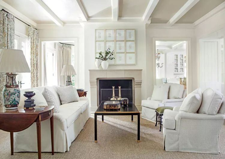
Crisp, cool “gallery” whites are giving way to warmer, softer whites. Many homeowners want cozier, livable rooms rather than minimalist, clinical whites.
H3: Best warm white choices
– Creamy off‑whites and soft taupes: These bring depth and softness while keeping spaces bright.
– How to choose: Test paint samples at different times of day—warm whites can look very different in morning vs. evening light. Architectural Digest’s white paint guide is a good starting resource.
H2: Millennial Pink — From Sweet to Earthy
H3: Why the pink trend cooled
Millennial pink had its moment as a flattering, soft accent. Designers now favor grounded, earthier tones that feel more timeless.
H3: Contemporary replacements
– Terracotta and warm clay tones: These provide the same flattering warmth but with a more mature, updated feel. (Learn more about the terracotta trend from House Beautiful.)
– Use terracotta in upholstery, accent walls, or ceramics to add warmth without overwhelming a palette.
H2: Certain Blues and Greens — Warm Tones Are Taking Priority
H3: What’s shifting
Although blue and green remain beautiful, demand for cooler shades is softening as homeowners favor warm tones—particularly ochres, earthy oranges, and warm neutrals that anchor bolder hues.
H3: How to balance color
– Warm, dark neutrals: Deep warm neutrals will anchor color choices and pair well with accent blues and greens when you still want color.
– If you love blues/greens: Opt for warmer, muted versions (e.g., teal with brown undertones or green with olive/khaki warmth) to keep rooms feeling contemporary.
H2: Design Takeaways — How to Choose Paint Colors for 2026
– Favor warmth: Look for paint swatches with warm undertones—creamy whites, greiges, warm taupes, terracotta, and deep browns.
– Test in place: Always sample large swatches on multiple walls and observe them at different times of day.
– Layer texture and finishes: Warm colors read best with mixed textures—wood, metal, natural fibers—to prevent flatness.
– Consider longevity: Choose colors that reflect how you live and want to feel in a room rather than chasing the most hyped shade.
H2: Quick Paint-Picker Resources
– Benjamin Moore Color of the Year and inspiration: https://www.benjaminmoore.com/en-us/color-of-the-year
– Greige paint family guide (Sherwin‑Williams): https://www.sherwin-williams.com/homeowners/color/find-and-explore-colors/paint-colors-by-family/greige
– Terracotta color trend overview (House Beautiful): https://www.housebeautiful.com/room-decorating/color/g32700774/terracotta-color-trend/
– White paint selection tips (Architectural Digest): https://www.architecturaldigest.com/story/best-white-paint-colors
Conclusion
The trend for 2026 points toward warmer, moodier, and earth-centered palettes. If you’re refreshing a room, prioritize warm undertones, test paints in real light, and use texture to create depth. Moving away from cool grays, stark whites, and overly sweet pastels will help ensure your space feels current—and comfortable—for years to come.


