Meta title: Bedroom Paint Colors to Avoid in 2026 — What to Replace Them With
Meta description: Designers predict pastel washes, cool grays, and trendy jewel-tone accents will feel dated in 2026. Learn why—plus timeless alternatives, testing tips, and pairing ideas for a calming, modern bedroom.
Focus keyword: bedroom paint colors to avoid 2026
Slug: bedroom-paint-colors-to-avoid-2026
H1: Bedroom Paint Colors to Avoid in 2026
Designers are steering bedrooms away from cold, overly trendy palettes and toward warm, comforting schemes that support rest and connection. Your wall color sets the mood, frames furnishings, and can either soothe or distract. Below are the three bedroom paint colors designers say it’s time to retire in 2026, why they’re falling out of favor, and practical, long-lasting alternatives.
H2: Why some paint colors are losing appeal
Design trends cycle between bold novelty and quiet staying power. Colors that read as icy, overly bright, or aggressively dramatic can start to feel dated as people seek spaces that feel restorative and personal. For research into how color affects mood and perception, see this primer on color psychology. For broader industry trend context, check color forecasts from major paint brands such as Benjamin Moore and Sherwin‑Williams.
H2: 3 bedroom paint color trends to retire in 2026
H3: 1) Cold pastels (icy blues and washed-out pinks)
Why retire them: Ultra-pale, desaturated pastels can read as clinical or fleeting—popular for a few seasons but lacking the depth to age well. They often feel more like a fashionable statement than a long-term retreat.
Better choices: Opt for softer, atmospheric tones—think whispering greens, muted mid‑blues, or warm, earthy neutrals. These hues create a calming backdrop that pairs well with natural textures.
Design note: If you love a hint of pink or powder blue, choose a dustier, warmer version or use the pastel sparingly in bedding and accents rather than on all four walls.
H3: 2) Cool, icy grays
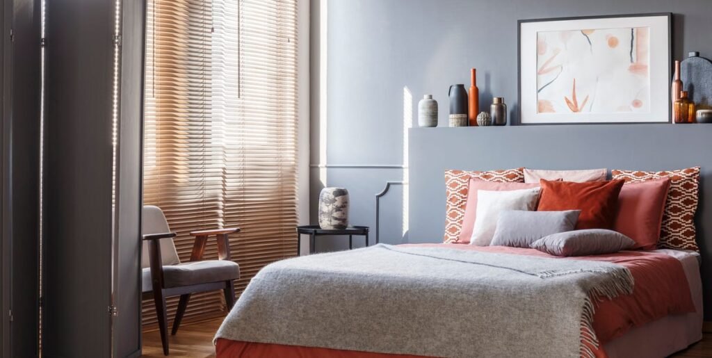
Why retire them: Cool grays were once the go-to neutral, but in a bedroom they can feel chilly and impersonal—opposite the inviting environment people now want.
Better choices: Warm neutrals like soft beiges, warm taupes, and mineral blues or olive-infused neutrals bring cozy depth while remaining versatile. For inspiration and seasonal palettes, review trend boards from leading paint houses.
Design note: Warm undertones in your wall paint can improve how textiles and wood tones appear, making the whole room feel more cohesive and comforting.
H3: 3) Bold, trendy accent colors (deep blues, forest greens, deep maroons)
Why retire them: Jewel‑toned accent walls and color‑drenched looks can be stunning, but they often date quickly and may compete with art and furniture, making a bedroom feel busy rather than restful.
Better choices: If you want drama, choose softer, nature-inspired shades—muted olive, terracotta, chocolate brown, or a softened mineral blue—applied in moderation or layered with neutral fields.
Design note: To keep an accent wall from overpowering the room, balance it with warm neutrals and lighter textiles; consider using rich colors on cabinetry or trim instead of all four walls.
H2: How to choose timeless bedroom paint colors (practical steps)
H3: Test large painted samples
Paint several 2‑ft swatches and observe them at different times of day and under your room’s lighting. For step-by-step guidance on testing paint, consult this practical how‑to guide.
H3: Consider undertones and lighting
Natural light changes a color dramatically. Cool morning light can make warm paints seem neutral, while warm evening light can amplify golden undertones. Always evaluate samples in the actual room.
H3: Pick a flexible palette, not a single shade
Create a layering system—main wall color (neutral or soft atmospheric), trim/ceiling (lighter neutral), and one or two accent tones drawn from textiles or artwork. This approach keeps the room adaptable over time.
H3: Coordinate with materials and textures
Earthy paints pair beautifully with natural wood, woven rugs, linen bedding, and matte finishes. Textures often have more long‑term appeal than purely dramatic color choices.
H2: Small updates that refresh without repainting
– Swap bedding, curtains, or rugs in warmer tones to soften a cool room.
– Add a headboard, artwork, or a textured wallpaper behind the bed to change the focal point.
– Refinish or restain wood furniture for a warmer overall palette.
H2: Quick palette ideas to replace the trends
– Whisper green + warm taupe + natural linen
– Mineral blue + soft beige + oak accents
– Warm terracotta + chocolate brown + cream textiles
Each of these combinations provides warmth, depth, and flexibility—qualities designers say will hold up better than icy pastels, cool grays, or short‑lived jewel tones.
H2: Final takeaway
In 2026, bedrooms will favor colors that feel inviting, restorative, and personal. Move away from ultra-cold pastels, flat cool grays, and fleeting jewel-tone accents, and lean into warm neutrals, muted nature-inspired hues, and layered palettes. For ongoing inspiration and curated palettes, explore leading paint brand trend pages and design resources.


